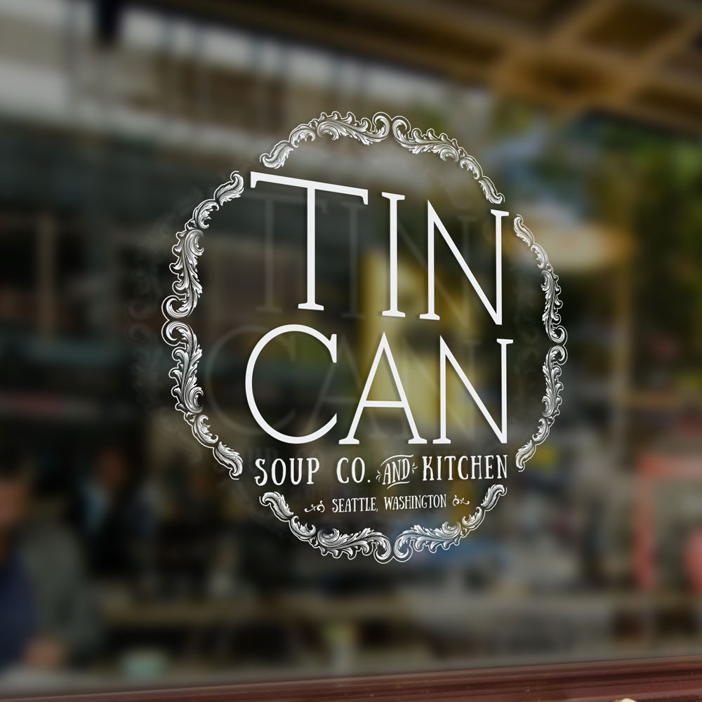
Tin Can Soup Co. & Kitchen
Tin Can Soup Co. & Kitchen is an up and coming eatery located in Seattle.

Tin Can Soup Co. & Kitchen is an up and coming eatery located in Seattle. In mid-May, they asked me to create a mark that communicates their business vision. In the research part of the logo we discussed their business model, the future decor of the site, reviewed other logos for design style preferences, and shared various files of inspiration. From there I started the project by developing the font for ‘Tin Can’ by using traditional pen and paper prior to the digital creation. After the main font was created we focused on the frame. Getting the frame just right took a bulk of the time because the client and I both liked the idea of a circle but since the logo is more rectangular we had to mold the frame to match the overall shape of the typography. After settling on a shape, I used design resources to develop the foliage that makes up the frame. The font for ‘Soup Co. & Kitchen’ and ‘Seattle, Washington’ was used to enhance the handmade character of the business. Altogether, this project took two months to develop, start to finish.

